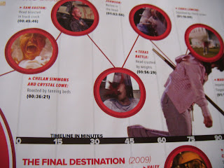
Influences: I have researched into existing infographics to get inspiration for my own infographic. I found a feature in Empire magazine which is similar to the layout I wanted to create for my infographic. This was a mind map documenting the deaths within horror films, which included a timeline from the within the movie. I wanted to create simple, but effective and eye catching, so I have decided to create an eye catching mind map.
 |
| Part of the Visual Mind Map (infographic) documenting death in the Final Destination movies within Empire Magazine. This is similar to the layout of my infographic. |
Fonts: I have also researched into the fonts related to thriller films. From researching into these fonts I have found out what typography is used within Thriller films. Shown below are two different types of fonts from thriller films. The Black Swan font is bold but also elegant, which suggests the meaning of the title as swans are elegant. The name of the film contrasts with the colours, but by making the font tall and elegant ties in with the film itself. The Sixth Sense title is very different to the Black Swan title. The Sixth Sense as a creepier feel to the font, it is almost childlike, which could link in with the characters and synopsis of the film. From my research I have gained the knowledge that typography for thriller films does depend on the film and concept, as this reflects the films theme and genre.
 |
| Existing Thriller Fonts |
My Final Fonts: From researching into existing fonts I have decided on a font which I believe reflects Thriller. I have decided to use the font below from dafont.com as the distressed look suggests thriller and compared to existing thriller fonts it is similar.
 |
| Thriller Font: dafont.com |
Group Discussion:
We had a group discussion today about our ideas for our infographics. We shared our ideas and got feedback from each other about our initial idea for our infographic. I was unsure about parts of my sketch and idea and I was able to be reassured by getting feedback on my idea. The aspects which I was unsure about was the shapes I would be using. I believed that there were too many circles within my sketch and from feedback I gained the idea of using blood splatters. I would place text or images inside this icon which would make the infographic interesting and eye catching. The blood splatters are also an icon within thriller movies, which links in well with the genre.
 |
| Blood Splatter which I could use within my infographic to place information. |
 |
| My Sketch for my Thriller Infographic. From feedback I have replaced the circles with blood splatters. |
No comments:
Post a Comment